How To Hide Ribbon From Users Without Edit Page Privilege in SharePoint 2010
Ribbon
is a great new feature introduced by SharePoint 2010. It provides great
user experience for users with elevated privileges, like contributors
and site owners. However, for users with lease privilege, such as
visitors and anonymous users, it seems like a big waste of page real
estate. Because for those users, all ribbon provides are navigation
breadcrumb and welcome control (user name with a drop down list on
top-right corner).
So I have been asked to figure out a way to remove or hide the ribbon area from user with lease privilege, and here is how:
1) Open your SharePoint master page
2) Locate this line:<div id="s4-ribbonrow" class="s4-pr s4-ribbonrowhidetitle">
3) Change it to:<div id="s4-ribbonrow" class="s4-pr s4-ribbonrowhidetitle" style="display:none">
4) Now find the end of the “s4-ribbonrow” tag and add following block right after it:<Sharepoint:SPSecurityTrimmedControl ID="SPSecurityTrimmedControl2" runat="server" PermissionsString="AddAndCustomizePages"> <script type="text/javascript"> document.getElementById("s4-ribbonrow").style.display = "block";
</script>
</Sharepoint:SPSecurityTrimmedControl>
</script>
</Sharepoint:SPSecurityTrimmedControl>
5) Save the new master page and publish it.
Now when a user without “AddAndCustomizePages”
access to view the site, they would not see the ribbon area. You may
want to move at least the welcome control to somewhere outside the
ribbon area so your lease privilege users can see their user names.
The
reason that you have to do it the other way around: make the ribbon
invisible (step 3) and make it visible only when users have “AddAndCustomizePages”
access (step 4) is the ribbon HTML code has to be rendered to the
browser otherwise you would lose some basic abilities on the page, like,
to be able to scroll up and do
----------------------------------------------------------------------------------------------
Hide the Ribbon from Anonymous Users
If you designed a custom master page for your SharePoint 2010 and the ribbon is in your way, SharePoint has a built-in control that lets you hide it from anonymous users in few easy steps. Open and check-out your master page, find where your ribbon control starts or look for <WebPartPages:SPWebPartManager id=”m” runat=”Server”/>. Place this control below <Sharepoint:SPSecurityTrimmedControl runat=”server” Permissions=”AddAndCustomizePages”>. Find where your ribbon control ends or look for <div id=s4-workspace> and place the closing control above it </SharePoint:SPSecurityTrimmedControl>. Save, check-in the master page and publish it to see the changes. From now on, only logged in users with the right permissions will be able to see the ribbon on the top.
You can also use SPSecurityTrimmedControl to hide from anonymous users almost any controls you want as long as you wrap it properly.
<Sharepoint:SPSecurityTrimmedControl runat="server" Permissions="ManageLists"> Put Your Control Here </SharePoint:SPSecurityTrimmedControl> |
EmptyMask – Has no permissions on the Web site. Not available through the user interface.
ViewListItems – View items in lists, documents in document libraries, and view Web discussion comments.
AddListItems – Add items to lists, add documents to document libraries, and add Web discussion comments.
EditListItems – Edit items in lists, edit documents in document libraries, edit Web discussion comments in documents, and customize Web Part Pages in document libraries.
DeleteListItems – Delete items from a list, documents from a document library, and Web discussion comments in documents.
ApproveItems – Approve a minor version of a list item or document.
OpenItems – View the source of documents with server-side file handlers.
ViewVersions – View past versions of a list item or document.
DeleteVersions – Delete past versions of a list item or document.
CancelCheckout – Discard or check in a document which is checked out to another user.
ManagePersonalViews – Create, change, and delete personal views of lists.
ManageLists – Create and delete lists, add or remove columns in a list, and add or remove public views of a list.
ViewFormPages – View forms, views, and application pages, and enumerate lists.
Open – Allow users to open a Web site, list, or folder to access items inside that container.
ViewPages – View pages in a Web site.
AddAndCustomizePages – Add, change, or delete HTML pages or Web Part Pages, and edit the Web site using a SharePoint Foundation–compatible editor.
ApplyThemeAndBorder – Apply a theme or borders to the entire Web site.
ApplyStyleSheets – Apply a style sheet (.css file) to the Web site.
ViewUsageData – View reports on Web site usage.
CreateSSCSite – Create a Web site using Self-Service Site Creation.
ManageSubwebs – Create subsites such as team sites, Meeting Workspace sites, and Document Workspace sites.
CreateGroups – Create a group of users that can be used anywhere within the site collection.
ManagePermissions – Create and change permission levels on the Web site and assign permissions to users and groups.
BrowseDirectories – Enumerate files and folders in a Web site using Microsoft Office SharePoint Designer 2007 and WebDAV interfaces.
BrowseUserInfo – View information about users of the Web site.
AddDelPrivateWebParts – Add or remove personal Web Parts on a Web Part Page.
UpdatePersonalWebParts – Update Web Parts to display personalized information.
ManageWeb – Grant the ability to perform all administration tasks for the Web site as well as manage content. Activate, deactivate, or edit properties of Web site scoped Features through the object model or through the user interface (UI). When granted on the root Web site of a site collection, activate, deactivate, or edit properties of site collection scoped Features through the object model. To browse to the Site Collection Features page and activate or deactivate site collection scoped Features through the UI, you must be a site collection administrator.
UseClientIntegration – Use features that launch client applications; otherwise, users must work on documents locally and upload changes.
UseRemoteAPIs – Use SOAP, WebDAV, or Microsoft Office SharePoint Designer 2007 interfaces to access the Web site.
ManageAlerts – Manage alerts for all users of the Web site.
CreateAlerts – Create e-mail alerts.
EditMyUserInfo – Allows a user to change his or her user information, such as adding a picture.
EnumeratePermissions – Enumerate permissions on the Web site, list, folder, document, or list item.
FullMask – Has all permissions on the Web site. Not available through the user interface.
The One Catch
You may notice that the login control (or welcome control) is actually inside the ribbon by default in SharePoint 2010. You'll probably want to pull this control out of the ribbon and place it elsewhere on your page. Just look for the line of code that looks like this:
1 |
<wssuc:Welcome id="IdWelcome" runat="server" EnableViewState="false"/> |
Move this code out of the ribbon and into another location within your master page. Save your changes, check in and approve all files, and anonymous users will never know your site is built on SharePoint 2010!
-------------------------------------------------------------------------------------------
Hide/Show SPRibbon Based on User PermissionString in SPD
Here i have explained the same step by step sir.
1. Just call the Jquery file in master page header section look like below.
<script type="text/javascript"
src="/Style%20Library/jquery-1.6.1.min.js"></script>
2. We need to be remove the welcome menu control from
SharePoint:DelegateControl, which was inside of this controls.
3. Add this below DIV controls after SPRibbon DIV tag closed.
<div class="s4-trc-container-menu1" style="text-align:right;float:right;width:100%; position:absolute;margin-top:10px;">
<div id="notificationArea1" class="s4-noti" style="right: 16px;
top: 0px; height: 22px">
<wssuc:Welcome id="IdWelcome1" runat="server"
EnableViewState="false"></wssuc:Welcome>
<wssuc:MUISelector ID="IdMuiSelector1" runat="server"/>
</div>
</div>
4. Then finally Add below script before body tag closed.
<script type="text/javascript">
var UserHasPermissions=false;
</script>
<Sharepoint:SPSecurityTrimmedControl runat="server" PermissionsString="ManageWeb">
<script type="text/javascript">
UserHasPermissions=true;
</script>
</SharePoint:SPSecurityTrimmedControl>
<script type="text/javascript">
if(UserHasPermissions)
{
document.getElementById("s4-trc-container-menu1").style.display="none";
}
else
{
document.write('<scr'+'ipt type="text/javascript" src="/Style Library/RemoveWelcomeMenuOption.js"></scr'+'ipt>');
if(getQueryVariable("IsDlg") != "undefined")
if(getQueryVariable("IsDlg")=="1")
{
document.getElementById("s4-ribboncont").style.display ="inline";
}
else
{
document.getElementById("s4-ribboncont").style.display ="none";
document.getElementById("s4-trc-container-menu1").style.display="block";
}
function getQueryVariable(varname) {
var query = window.location.search.substring(1);
var vars = query.split("&");
for (var i=0;i<vars.length;i++)
{
var pair = vars[i].split("=");
if (pair[0] == varname)
{
return pair[1];
}
}
}
}
</script>
RemoveWelcomeMenuOption.js
jQuery(document).ready(function($){
$("[text='My Settings']").remove();
$("[text='Personalize this Page']").remove();
});
$("[text='My Settings']").remove();
$("[text='Personalize this Page']").remove();
});
To increase width of left navigation
.s4-ca {
MARGIN-LEFT: 205px;
}
BODY #s4-leftpanel {
WIDTH: 205px; FLOAT: left
}
MARGIN-LEFT: 205px;
}
BODY #s4-leftpanel {
WIDTH: 205px; FLOAT: left
}
------------------------------------------------------------------------
<div class="ms-quicklaunchheader">
<SharePoint:SPLinkButton id="idNavLinkViewAll" runat="server" NavigateUrl="~site/_layouts/viewlsts.aspx" Text="<%$Resources:wss,quiklnch_allcontent%>" AccessKey="<%$Resources:wss,quiklnch_allcontent_AK%>"/>
</div>
</SharePoint:SPSecurityTrimmedControl>
Hide "View All Site Content" link for anonymous users in SharePoint
This solution requires you to install Microsoft Office SharePoint Designer.
- Go to "Site Actions" ==> "Site Settings"
- Under Galleries, click on "Master Pages"
- Select default.master and select "Edit in Microsoft Office SharePoint Designer".
- In "Design" view locate "View All Site Content" on the left-hand-site navigation bar and click on it.
- Go to "Code" view. You will see the following code highlighted:
<div class="ms-quicklaunchheader">
<SharePoint:SPLinkButton id="idNavLinkViewAll" runat="server" NavigateUrl="~site/_layouts/viewlsts.aspx" Text="<%$Resources:wss,quiklnch_allcontent%>" AccessKey="<%$Resources:wss,quiklnch_allcontent_AK%>"/>
</div>
</SharePoint:SPSecurityTrimmedControl>
- Change the PermissionString attribute value of the Sharepoint:SPSecurityTrimmedControl XML element from ViewFormPages to BrowseDirectories.
- Save the default.master. If you login as an anonymous user you will not see the "View All Site Content" link. However when authenticated you will see this option.
NOTE: The "BrowseDirectories" permission is common to both the "Members" and "Owners" group permission levels, but is not set for the "Limited Access" (anonymous users) permission level. See a complete list of the SPBasePermissions Enumeration here.
--------------------------------------------------------------------------------------------
SharePoint 2010 Base CSS Classes
This will be the first of many SharePoint 2010 posts. I will be focusing on a few of the main CSS classes used for SharePoint 2010 Public Beta. As the product becomes more final there might be some changes to the class names but I will be sure to create a new post if that happens. This will be quite a lengthy but it should be helpful. The default CSS given below are just highlights of the full CSS attributes for that class.
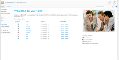
I will be using a basic team site as my base for the screenshots.

Here is a basic structure of the main areas that I will cover.
Class/ID = “body #s4-ribbonrow”
Default CSS:
min-height:43px;
background-color:#21374c; Comments: This is the container for all of the items in the top ribbon

Table Row Left:
Class/ID = “ms-cui-TabRowLeft”
Default CSS:
float:left;
margin-top:20px; Comments: This is the container Site Actions, Navigate Up and Edit

Site Actions:
Class/ID = “ms-siteactionsmenuinner”
Default CSS:
border-color:#21374C;
border-top-color:#394f63;
background:url("/_layouts/images/bgximg.png") repeat-x -0px -467px;
background-color:#21374c; Comments: Main Style for Site Actions menu

Navigate Up:
Class/ID = “.s4-breadcrumb-anchor,.ms-qatbutton”
Default CSS:
margin:0px 3px 0px 0px;
padding:2px 5px 0px; Comments: There is an image “fgimg.png” that sits within an “A” hyperlink Tag. This image is large and has many icons in it. It uses inline absolute positioning to show the correct Icon.
”position: absolute; top: -112px !important;”

Here is what the “fgimg.png” image looks like:

Edit:
Class/ID = “.s4-breadcrumb-anchor,.ms-qatbutton” (Same as Above)
Default CSS:
Same As Above Comments: Same as above except that the background image position is different. “position: absolute; top: -235px;”

Browse:
Class/ID = “.ms-cui-tt-s > .ms-cui-tt-a”
Default CSS:
border-color:#b6babf;
background-color:#fff;
color:#23272c !important; Comments: This is the selected state of the browse button. Note the “s” at the end of the class.

Page:
Class/ID = “.ms-cui-tt-span”
Default CSS:
padding:4px 10px 4px;
border-top:1px solid transparent;
text-align:center; Comments: This is the non-selected state of the page button.

Give Feedback:
Class/ID = “No Class Or ID Specified, See below”
Default CSS:
Inline CSS and Image Comments: If you would like to remove this icon via CSS, use the following:
.ms-cui-TabRowRight a img{
display: none;
}

Welcome Menu:
Class/ID = “.ms-welcomeMenu”
Default CSS:
padding:2px 5px 3px;
margin:0px 3px;
font-size:1em;
font-family:Verdana,sans-serif;
border:1px solid transparent; Comments: The class for the arrow is “.ms-viewselector-arrow”

Workspace:
Class/ID = “body #s4-workspace”
Default CSS:
overflow:visible !important; overflow-y:scroll;
overflow-x:auto;
position:relative;
left:0px; Comments: This is the container and scroll area for the site.
Body Container:
Class/ID = “body #s4-bodyContainer”
Default CSS:
min-width:760px; Comments: This class controls the minimum width.
Title Row:
Class/ID = “body #s4-titlerow”
Default CSS:
display:block !important; Comments: This is the container for the Title, Tags, Ribbon, Main navigation, Search and Help.

Title Row:
Class/ID = “.s4-title”
Default CSS:
padding:0px 0px 0px 10px;
margin:0px;
min-height:64px;
background:url("/_layouts/images/bgximg.png") repeat-x -0px -1013px;
background-color:#f9f9f9;
word-wrap:break-word;
-ms-word-wrap:break-word;
overflow-x:hidden; Comments: Notice that there is a min height of 64px and a background image is applied by default.
 Title Logo:
Class/ID = “.s4-titlelogo”
Default CSS:
padding:12px 10px 12px 0px;
text-align:center;
vertical-align:middle; Comments: The logo can be changed via the Admin UI. Default Image size is 35x35px

Title Text:
Class/ID = “.s4-titletext”
Default CSS:
width:100%; Comments: The title text is also the bread crumb.

Page Description:
Class/ID = “.s4-title .s4-pagedescription,.s4-title .s4uniqpermdescription”
Default CSS:
margin-top:6px;
font-size:1em;
color:#5d6878;
font-weight:normal; Comments: This only shows up if you have specified a description of the site.

Social Data:
Class/ID = “ms-socialNotif-Container”
Default CSS:
width:120px;
overflow-x:auto;
overflow-y:hidden;
padding:0px 3px; Comments: This is the container that holds both I Like It and Notes.

Social Separator:
Class/ID = “.ms-socialNotif-groupSeparator”
Default CSS:
height:60px;
position:relative;
top:4px;
margin:0px 3px;
border-right:1px solid;
border-right-color:#e7e7e8; Comments: This is the slight line on the left of the social tags.

I Like It:
Class/ID = “.ms-socialNotif”
Default CSS:
width:48px;
height:60px;
overflow:hidden;
margin:0px 1px;
padding:0px 2px;
border:1px solid transparent; Comments: This class is shared with the tags and notes. The text uses the class “.ms-socialNotif-text” and the image “mossfgimg.png” with inline style of
position: absolute; top: -132px !important;
Here is what the “mossfgimg.png” image looks like:

Tags & Notes:
Class/ID = “.ms-socialNotif”
Default CSS:
Same As “I Like It” above Comments: This class is shared with the I like It Feature. The image “mossfgimg.png” with inline style of
position: absolute; top: -300px !important;
Top Header 2:
Class/ID = “body #s4-topheader2”
Default CSS:
background:url("/_layouts/images/selbg.png") repeat-x left top;
background-color:#f6f6f6;
vertical-align:middle;
min-height:25px;
border-top:1px solid #e0e0e0;
border-bottom:1px solid #b8babd; Comments: This class makes up the majority of the navigation row style. Top Links:
Class/ID = “.s4-toplinks”
Default CSS:
padding:0px; Comments: This is the container for the main navigation, search and help.

Top Link Selected:
Class/ID = “.s4-toplinks .s4-tn a.selected”
Default CSS:
border-color:#91cdf2;
border-bottom-color:#addbf7;
border-top-color:#c6e5f8;
background:url("/_layouts/images/selbg.png") repeat-x left top;
background-color:#ccebff;
color:#003759;
padding:4px 5px;
margin:0px 5px; Comments: The hover class is “.s4-toplinks .s4-tn a.selected:hover”

Top Link Static:
Class/ID = “.s4-tn li.static > .menu-item”
Default CSS:
color:#3b4f65;
white-space:nowrap;
border:1px solid transparent;
padding:4px 10px;
height:15px; Comments: The hover class is “.s4-tn li.static > a:hover”

Search:
Class/ID = “.s4-search table”
Default CSS:
width: 212px;
margin-right: 17px; Comments: This is the container for the search box. The class resides in the Search.css file.

Search Input:
Class/ID = “.s4-search input”
Default CSS:
width: 212px;
margin-right: 17px; Comments: Note that this class does not change width, border color or height. You could use this to change the background color.
Search Image:
Class/ID = “.s4-search .ms-searchimage”
Default CSS:
background-color:#fff;
border:1px solid #e3e3e3 !important;
height:16px;
padding:2px 3px 1px;
border-left:none !important;
margin-top:3px; Comments: This class controls the border around the go image.

Help:
Class/ID = “.s4-help”
Default CSS:
margin:4px; Comments: This uses the “fgimg.png” with inline style of:
position: absolute; top: -293px !important;

Status Bar Container:
Class/ID = “.s4-statusbarcontainer”
Default CSS:
None Comments: I am not 100% sure where or how this is used. I can only imagine that this is a publishing class.
Main Area:
Class/ID = “body #s4-mainarea”
Default CSS:
float:left;
clear:both; Comments: This includes both left navigation and content
 Left Panel:
Class/ID = “body #s4-leftpanel”
Default CSS:
width:155px;
float:left; Comments: This is the left navigation
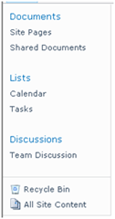
Left Panel Headers:
Class/ID = “.s4-ql ul.root > li > .menu-item,.s4-qlheader,.s4-qlheader:visited”
Default CSS:
font-size:1.2em;
color:#0072bc;
margin:0px;
padding:3px 4px 3px 10px;
word-wrap:break-word;
overflow-x:hidden; Comments: This class controls the look of the header text

Left Panel Links:
Class/ID = “.s4-ql ul.root ul > li > a”
Default CSS:
padding:3px 4px 4px 10px;
color:#3b4f65;
word-wrap:break-word;
overflow-x:hidden;
zoom:1; Comments: This class controls the look of the link text

Special Navigation Links List:
Class/ID = “.s4-specialNavLinkList”
Default CSS:
margin:0px;
border-top:1px solid #dbddde;
padding-top:5px; Comments: This class makes the line above the recycle bin

Recycle Bin:
Class/ID = “.s4-specialNavLinkList a”
Default CSS:
padding:3px 4px 3px 10px;
color:#3b4f65; Comments: This is a shared class with view all site content

View All Site Content:
Class/ID = “.s4-specialNavLinkList a”
Default CSS:
Same As Above Comments: This is a shared class with Recycle Bin

Content Table Body Area:
Class/ID = “.s4-ca”
Default CSS:
margin-left:155px;
margin-right:0px;
min-height:324px; Comments: This is main class for the body content. Notice the 155px margin to the left. This basically moves the content over so that it does not overlap the left navigation.
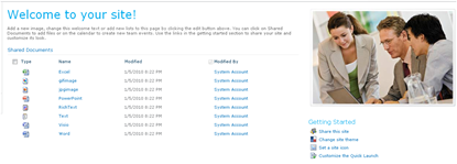
Web Part Cell:
Class/ID = “.s4-wpcell”
Default CSS:
border:1px solid transparent; Comments: This would be a good class to define a pixel line around web parts.

Web Part Header:
Class/ID = “.ms-WPHeader”
Default CSS:
background-color:#FFFFFF; Comments: This controls the background color of the wp header.
Web Part Header TD:
Class/ID = “.ms-WPHeader td”
Default CSS:
border-bottom:1px solid #EBEBEB; Comments: This controls the border color of the wp header.
Web Part Header Menu:
Class/ID = “.ms-WPHeaderTdMenu”
Default CSS:
width:21px;
border:1px solid transparent; Comments: This class is for the web part menu spacing.

Web Part Header Selection:
Class/ID = “.ms-WPHeaderTdSelection”
Default CSS:
width:21px; Comments: This class is for the web part selector spacing.

Web Part Content:
Class/ID = “.ms-wpContentDivSpace”
Default CSS:
margin-left:5px;
margin-right:5px; Comments: This class adds marginal space left and right for the web part content.
There are many many many more classes that I could cover but these are some of the main ones to get you going. I will cover more in future posts.
I will be using a basic team site as my base for the screenshots.

Here is a basic structure of the main areas that I will cover.
- Ribbon Row
- Table Row Left
- Site Actions
- Navigate Up
- Edit
- Tab List
- Browse
- Page
- Table Row Right
- Give Feedback
- Welcome Menu
- Table Row Left
- Workspace
- Body Container
- Title Row
- Title
- Title Logo
- Title Text / Breadcrumb
- Page Description
- Social Data
- Separator
- I like It
- Tags/Notes
- Top Header 2/Top Links
- li Static-Selected
- li Static
- Search
- Help
- Title
- Status Bar Container
- Main Area
- Left Panel
- Navigation Manager
- li Static (Header)
- ul li Static (Link)
- Special Navigation Links List
- Recycle Bin
- View All Site Content
- Navigation Manager
- Content Table / Body Area
- Web Part Cell
- Web Part Header
- WP Title
- WP Header TD
- WP Header Menu
- WP Header Selection
- Web Part Content
- Web Part Header
- Web Part Cell
- Left Panel
- Title Row
- Body Container
Class/ID = “body #s4-ribbonrow”
Default CSS:
min-height:43px;
background-color:#21374c; Comments: This is the container for all of the items in the top ribbon
Table Row Left:
Class/ID = “ms-cui-TabRowLeft”
Default CSS:
float:left;
margin-top:20px; Comments: This is the container Site Actions, Navigate Up and Edit

Site Actions:
Class/ID = “ms-siteactionsmenuinner”
Default CSS:
border-color:#21374C;
border-top-color:#394f63;
background:url("/_layouts/images/bgximg.png") repeat-x -0px -467px;
background-color:#21374c; Comments: Main Style for Site Actions menu
Navigate Up:
Class/ID = “.s4-breadcrumb-anchor,.ms-qatbutton”
Default CSS:
margin:0px 3px 0px 0px;
padding:2px 5px 0px; Comments: There is an image “fgimg.png” that sits within an “A” hyperlink Tag. This image is large and has many icons in it. It uses inline absolute positioning to show the correct Icon.
”position: absolute; top: -112px !important;”
Here is what the “fgimg.png” image looks like:

Edit:
Class/ID = “.s4-breadcrumb-anchor,.ms-qatbutton” (Same as Above)
Default CSS:
Same As Above Comments: Same as above except that the background image position is different. “position: absolute; top: -235px;”
Browse:
Class/ID = “.ms-cui-tt-s > .ms-cui-tt-a”
Default CSS:
border-color:#b6babf;
background-color:#fff;
color:#23272c !important; Comments: This is the selected state of the browse button. Note the “s” at the end of the class.
Page:
Class/ID = “.ms-cui-tt-span”
Default CSS:
padding:4px 10px 4px;
border-top:1px solid transparent;
text-align:center; Comments: This is the non-selected state of the page button.
Give Feedback:
Class/ID = “No Class Or ID Specified, See below”
Default CSS:
Inline CSS and Image Comments: If you would like to remove this icon via CSS, use the following:
.ms-cui-TabRowRight a img{
display: none;
}
Welcome Menu:
Class/ID = “.ms-welcomeMenu”
Default CSS:
padding:2px 5px 3px;
margin:0px 3px;
font-size:1em;
font-family:Verdana,sans-serif;
border:1px solid transparent; Comments: The class for the arrow is “.ms-viewselector-arrow”
Workspace:
Class/ID = “body #s4-workspace”
Default CSS:
overflow:visible !important; overflow-y:scroll;
overflow-x:auto;
position:relative;
left:0px; Comments: This is the container and scroll area for the site.

Body Container:
Class/ID = “body #s4-bodyContainer”
Default CSS:
min-width:760px; Comments: This class controls the minimum width.
Title Row:
Class/ID = “body #s4-titlerow”
Default CSS:
display:block !important; Comments: This is the container for the Title, Tags, Ribbon, Main navigation, Search and Help.
Title Row:
Class/ID = “.s4-title”
Default CSS:
padding:0px 0px 0px 10px;
margin:0px;
min-height:64px;
background:url("/_layouts/images/bgximg.png") repeat-x -0px -1013px;
background-color:#f9f9f9;
word-wrap:break-word;
-ms-word-wrap:break-word;
overflow-x:hidden; Comments: Notice that there is a min height of 64px and a background image is applied by default.
Class/ID = “.s4-titlelogo”
Default CSS:
padding:12px 10px 12px 0px;
text-align:center;
vertical-align:middle; Comments: The logo can be changed via the Admin UI. Default Image size is 35x35px
Title Text:
Class/ID = “.s4-titletext”
Default CSS:
width:100%; Comments: The title text is also the bread crumb.
Page Description:
Class/ID = “.s4-title .s4-pagedescription,.s4-title .s4uniqpermdescription”
Default CSS:
margin-top:6px;
font-size:1em;
color:#5d6878;
font-weight:normal; Comments: This only shows up if you have specified a description of the site.
Social Data:
Class/ID = “ms-socialNotif-Container”
Default CSS:
width:120px;
overflow-x:auto;
overflow-y:hidden;
padding:0px 3px; Comments: This is the container that holds both I Like It and Notes.

Social Separator:
Class/ID = “.ms-socialNotif-groupSeparator”
Default CSS:
height:60px;
position:relative;
top:4px;
margin:0px 3px;
border-right:1px solid;
border-right-color:#e7e7e8; Comments: This is the slight line on the left of the social tags.
I Like It:
Class/ID = “.ms-socialNotif”
Default CSS:
width:48px;
height:60px;
overflow:hidden;
margin:0px 1px;
padding:0px 2px;
border:1px solid transparent; Comments: This class is shared with the tags and notes. The text uses the class “.ms-socialNotif-text” and the image “mossfgimg.png” with inline style of
position: absolute; top: -132px !important;
Here is what the “mossfgimg.png” image looks like:
Tags & Notes:
Class/ID = “.ms-socialNotif”
Default CSS:
Same As “I Like It” above Comments: This class is shared with the I like It Feature. The image “mossfgimg.png” with inline style of
position: absolute; top: -300px !important;
Top Header 2:
Class/ID = “body #s4-topheader2”
Default CSS:
background:url("/_layouts/images/selbg.png") repeat-x left top;
background-color:#f6f6f6;
vertical-align:middle;
min-height:25px;
border-top:1px solid #e0e0e0;
border-bottom:1px solid #b8babd; Comments: This class makes up the majority of the navigation row style. Top Links:
Class/ID = “.s4-toplinks”
Default CSS:
padding:0px; Comments: This is the container for the main navigation, search and help.
Top Link Selected:
Class/ID = “.s4-toplinks .s4-tn a.selected”
Default CSS:
border-color:#91cdf2;
border-bottom-color:#addbf7;
border-top-color:#c6e5f8;
background:url("/_layouts/images/selbg.png") repeat-x left top;
background-color:#ccebff;
color:#003759;
padding:4px 5px;
margin:0px 5px; Comments: The hover class is “.s4-toplinks .s4-tn a.selected:hover”
Top Link Static:
Class/ID = “.s4-tn li.static > .menu-item”
Default CSS:
color:#3b4f65;
white-space:nowrap;
border:1px solid transparent;
padding:4px 10px;
height:15px; Comments: The hover class is “.s4-tn li.static > a:hover”
Search:
Class/ID = “.s4-search table”
Default CSS:
width: 212px;
margin-right: 17px; Comments: This is the container for the search box. The class resides in the Search.css file.
Search Input:
Class/ID = “.s4-search input”
Default CSS:
width: 212px;
margin-right: 17px; Comments: Note that this class does not change width, border color or height. You could use this to change the background color.
Search Image:
Class/ID = “.s4-search .ms-searchimage”
Default CSS:
background-color:#fff;
border:1px solid #e3e3e3 !important;
height:16px;
padding:2px 3px 1px;
border-left:none !important;
margin-top:3px; Comments: This class controls the border around the go image.
Help:
Class/ID = “.s4-help”
Default CSS:
margin:4px; Comments: This uses the “fgimg.png” with inline style of:
position: absolute; top: -293px !important;
Status Bar Container:
Class/ID = “.s4-statusbarcontainer”
Default CSS:
None Comments: I am not 100% sure where or how this is used. I can only imagine that this is a publishing class.
Main Area:
Class/ID = “body #s4-mainarea”
Default CSS:
float:left;
clear:both; Comments: This includes both left navigation and content
 Left Panel:
 Class/ID = “body #s4-leftpanel”
Default CSS:
width:155px;
float:left; Comments: This is the left navigation

Left Panel Headers:
Class/ID = “.s4-ql ul.root > li > .menu-item,.s4-qlheader,.s4-qlheader:visited”
Default CSS:
font-size:1.2em;
color:#0072bc;
margin:0px;
padding:3px 4px 3px 10px;
word-wrap:break-word;
overflow-x:hidden; Comments: This class controls the look of the header text
Left Panel Links:
Class/ID = “.s4-ql ul.root ul > li > a”
Default CSS:
padding:3px 4px 4px 10px;
color:#3b4f65;
word-wrap:break-word;
overflow-x:hidden;
zoom:1; Comments: This class controls the look of the link text

Special Navigation Links List:
Class/ID = “.s4-specialNavLinkList”
Default CSS:
margin:0px;
border-top:1px solid #dbddde;
padding-top:5px; Comments: This class makes the line above the recycle bin
Recycle Bin:
Class/ID = “.s4-specialNavLinkList a”
Default CSS:
padding:3px 4px 3px 10px;
color:#3b4f65; Comments: This is a shared class with view all site content
View All Site Content:
Class/ID = “.s4-specialNavLinkList a”
Default CSS:
Same As Above Comments: This is a shared class with Recycle Bin
Content Table Body Area:
Class/ID = “.s4-ca”
Default CSS:
margin-left:155px;
margin-right:0px;
min-height:324px; Comments: This is main class for the body content. Notice the 155px margin to the left. This basically moves the content over so that it does not overlap the left navigation.

Web Part Cell:
Class/ID = “.s4-wpcell”
Default CSS:
border:1px solid transparent; Comments: This would be a good class to define a pixel line around web parts.

Web Part Header:
Class/ID = “.ms-WPHeader”
Default CSS:
background-color:#FFFFFF; Comments: This controls the background color of the wp header.
Web Part Header TD:
Class/ID = “.ms-WPHeader td”
Default CSS:
border-bottom:1px solid #EBEBEB; Comments: This controls the border color of the wp header.
Web Part Header Menu:
Class/ID = “.ms-WPHeaderTdMenu”
Default CSS:
width:21px;
border:1px solid transparent; Comments: This class is for the web part menu spacing.
Web Part Header Selection:
Class/ID = “.ms-WPHeaderTdSelection”
Default CSS:
width:21px; Comments: This class is for the web part selector spacing.
Web Part Content:
Class/ID = “.ms-wpContentDivSpace”
Default CSS:
margin-left:5px;
margin-right:5px; Comments: This class adds marginal space left and right for the web part content.
There are many many many more classes that I could cover but these are some of the main ones to get you going. I will cover more in future posts.

No comments:
Post a Comment